
Thay đổi theme – custom giao diện CyberPanel
CyberPanel từ phiên bản 2.x có thêm chức năng custom css giúp bạn có thể code css để làm đẹp cho bảng điều khiển CyberPanel thêm bắt mắt hơn.
Trong bài viết này Vũ Trụ Số share 1 theme mà bạn có thể copy và dán ngay vào phần Design của CyberPanel
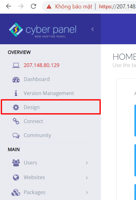
Để thêm custom css vào CyberPanel bạn có thể truy cập vào CyberPanel và click vào Design như hình dưới đây
Tiếp đó bạn có thể thêm đoạn code css dưới đây vào để thay đổi theme cho CyberPanel
#sidebar-menu-item-plugins,
#sidebar-menu-item-dashboard,
#sidebar-menu-item-server-ip-address,
#sidebar-menu-item-ftp,
#sidebar-menu-item-email,
#sidebar-menu-item-dns,
#sidebar-menu-item-mail-settings,
#sidebar-menu-item-docker,
#sidebar-menu-item-containerization,
#sidebar-menu-item-cloudlinux,
#header-nav-right .hdr-btn {
  display: none !important;
}

ul#sidebar-menu li:nth-child(2) a:last-child {
  display: none !important;
}

body {
  background-image: url(https://live.staticflickr.com/65535/51705970602_9f5ec7b9a8_k.jpg);
  background-size: 100% 100%;
  background-attachment: fixed;
  background-position: center;
  background-repeat: no-repeat;
  transition: background 0.2s;
  color: #fff;
}

a,
a:hover,
a:focus {
  text-decoration: none;
  color: #fff;
}
a {
  color: #fff;
}
a:hover {
  color: #dee4e7;
}

.table-responsive .col-lg-9 {
  padding: 2px 0 0 15px;
  width: 64vw !important;
  height: auto;
  border-bottom: unset !important;
}

.content-box-header h2 {
  color: #fff !important;
  font-size: 1.4em;
}

.col-lg-9 .content-box-header {
  margin: 0 !important;
}

.panel-body .form-group {
  border: unset;
}

.form-group .alert-success p {
  color: #32ab13 !important;
}

.col-sm-12 .alert p {
  color: #32ab13 !important;
}

#page-header .badge {
  color: #fff;
  background-color: #ffc107;
  font-size: 0.95em;
  padding-right: 0.6em;
  padding-left: 0.6em;
  border-radius: 10rem;
}

.panel p {
  color: #fff;
  padding: 0 15px;
}

.col-sm-4 .table th,
.col-sm-8 .table th {
  color: #fff;
}

.form-group .col-sm-8 .table {
  color: #fff;
  background-color: rgb(255 255 255 / 24%);
  border-color: rgb(255 255 255 / 14%);
  margin: 40px 0 !important;
}

.form-group .col-sm-4 .table {
  color: #fff;
  background-color: rgb(255 255 255 / 24%);
  border-color: rgb(255 255 255 / 14%);
  margin: 20px 0 !important;
}

.example-box-wrapper .dbDetails button:hover {
  color: #fff;
  background-color: rgb(255 255 255 / 2%);
  border-color: rgb(255 255 255 / 0.54);
}

.example-box-wrapper .dbDetails button {
  color: #fff;
  background-color: rgb(255 255 255 / 14%);
  border-color: rgb(255 255 255 / 0.24);
}

.example-box-wrapper .dbDetails span {
  color: #fff;
  font-weight: 500;
}

.select2-container--default
  .select2-selection--single
  .select2-selection__rendered {
  color: #fff;
  line-height: 28px;
  display: block;
  padding-left: 8px;
  padding-right: 20px;
  overflow: hidden;
  text-overflow: ellipsis;
  white-space: nowrap;
}

.select2-container--default .select2-selection--single {
  /* border: 1px solid #aaa; */
  border-radius: 4px;
  background-color: rgb(255 255 255 / 0.24);
  border: 1px solid rgb(255 255 255 / 0.3);
  border-radius: 0.25rem;
  -webkit-transition: border-color 0.15s ease-in-out,
    -webkit-box-shadow 0.15s ease-in-out;
  transition: border-color 0.15s ease-in-out,
    -webkit-box-shadow 0.15s ease-in-out;
  transition: border-color 0.15s ease-in-out, box-shadow 0.15s ease-in-out;
  transition: border-color 0.15s ease-in-out, box-shadow 0.15s ease-in-out,
    -webkit-box-shadow 0.15s ease-in-out;
  width: 100%;
}

.form-group .border-red {
  color: #fff !important;
  background-color: #f02769;
  border-color: #f02769 !important;
}

.form-group .border-purple {
  color: #fff !important;
  background-color: #5a7684;
  border-color: #5a7684 !important;
}

.table {
  margin: 0 !important;
  padding: 10px 10px;
  background: transparent;
}

/** Thanks to @mhimon **/
.table td {
  border-color: transparent !important;
  color: #fff;
}

.col-sm-12 .table th {
  color: #fff;
}

.form-group .table {
  color: #fff;
  background-color: rgb(255 255 255 / 24%);
  border-color: rgb(255 255 255 / 14%);
}

.checkbox label {
  color: #fff;
}

.form-group select.form-control option {
  background-color: rgb(0 0 0 / 72%);
  border: 1px solid rgb(255 255 255 / 14%);
  color: #fff;
  font-size: 1.2em;
  font-weight: 500;
}

.form-group .col-sm-6 .ng-valid {
  background-color: rgb(0 0 0 / 12%);
  border: 1px solid rgb(255 255 255 / 14%);
  box-shadow: unset;
  color: #fff;
  line-height: 2em;
  font-size: 1.1em;
}

.form-group .col-sm-6 input {
  background-color: rgb(0 0 0 / 12%);
  border: 1px solid rgb(255 255 255 / 14%);
  color: #ffffff;
  box-shadow: unset;
}

.form-group {
  color: #fff;
}

.form-group .control-label,
.form-group .text-right {
  color: #e0ca2d;
}

.panel {
  box-shadow: 0 0.1rem 0.7rem rgb(0 0 0 / 18%);
  border: 1px solid rgba(0, 0, 0, 0);
  margin-bottom: 30px;
  background-color: rgb(0 0 0 / 0.24);
}

#sidebar-menu li .sidebar-submenu ul li {
  border: unset;
}

#sidebar-menu li .sidebar-submenu ul li a:hover {
  color: #ffffff;
  text-decoration: none;
  background: rgb(255 255 255 / 14%);
}

#sidebar-menu li .sidebar-submenu {
  margin-top: 0;
  border: 1px solid rgb(237 237 237 / 12%);
}

#sidebar-menu li .sidebar-submenu ul li a.sfActive {
  background: rgb(255 255 255 / 14%);
  color: #fff;
}

.sidebar-submenu ul {
  border: 1px solid rgb(237 237 237 / 12%);
  background: rgb(0 0 0 / 12%);
}

#page-sidebar ul li.sfHover>
a.sf-with-ul {
  border-color: rgb(255 255 255 / 14%);
  background: rgb(255 255 255 / 14%);
  text-decoration: none;
  color: #fff;
}

#page-title {
  padding: 0 0 4rem 0;
  color: #fff;
  text-align: center;
}

#page-title h2 {
  font-size: 2rem;
  font-weight: 700 !important;
  line-height: 1.8em;
  color: #fff !important;
}

.divider {
  display: none;
}

.bg-gradient-9,
#page-content {
  background: unset !important;
}

#sidebar-menu,
#header-logo {
  background: rgb(0 0 0 / 24%);
  border-right: 1px solid rgb(255 255 255 / 14%);
  box-shadow: none;
  transition: all 0.2s ease-out;
}
.sf-js-enabled {
  background: rgb(18 14 40 / 87%) !important;
  transition: all 0.2s ease-out !important;
}

#page-sidebar .header {
  color: #fff !important;
}

#page-sidebar ul li a .glyph-icon {
  color: #fff;
}

.content-box-header {
  color: #fff;
}

.mx-10.col-lg-9.panel.col-md-push-50,
.mx-10.col-md-2.panel.panel-body.col-md-pull-50 {
  box-shadow: 0 0.1rem 0.7rem rgb(0 0 0 / 18%);
  border: 1px solid rgba(0, 0, 0, 0);
  margin-bottom: 30px;
  background-color: rgb(0 0 0 / 0.24);
}

.btn-primary {
  box-shadow: 0 0.1rem 0.7rem rgb(0 0 0 / 18%);
  border: 1px solid rgba(0, 0, 0, 0);
  margin-bottom: 30px;
  background-color: rgb(0 0 0 / 0.24);
}

.btn-primary:hover {
  color: #fff;
  background-color: rgb(255 255 255 / 2%);
  border-color: rgb(255 255 255 / 0.54);
}

.col-md-2 .content-box-header {
  text-align: center;
  margin: 0 0 1.8rem 0;
}

.col-lg-9 .content-box-header {
  margin: 0 0 1.8rem 0;
}

.c100 {
  background-color: rgb(0 0 0 / 0.24);
}

.c100:after {
  background: unset;
}

#logout-btn {
  background: #f44c4c;
}

#page-sidebar ul li a:hover {
  color: #ffffff;
  text-decoration: none;
  background: rgb(255 255 255 / 14%);
  border-color: rgb(255 255 255 / 14%);
}

.select2-container--default .select2-selection--single,
.select2-container--default .select2-search--dropdown .select2-search__field,
.select2-dropdown {
  border-radius: 4px;
  background-color: rgb(255 255 255 / 0.24);
  border: 1px solid rgb(255 255 255 / 0.3);
  border-radius: 0.25rem;
  -webkit-transition: border-color 0.15s ease-in-out,
    -webkit-box-shadow 0.15s ease-in-out;
  transition: border-color 0.15s ease-in-out,
    -webkit-box-shadow 0.15s ease-in-out;
  transition: border-color 0.15s ease-in-out, box-shadow 0.15s ease-in-out;
  transition: border-color 0.15s ease-in-out, box-shadow 0.15s ease-in-out,
    -webkit-box-shadow 0.15s ease-in-out;
  width: 100%;
}
.select2-container--default
  .select2-selection--single
  .select2-selection__rendered {
  color: #fff;
}
.select2-container--default .select2-results__option--selected {
  background-color: #202124;
}
.badge,
.bs-badge {
  font-size: 13px;
  min-width: 40px;
  border-radius: 3px;
}
.badge,
.bs-badge,
.bs-label {
  color: #fff;
  background-image: linear-gradient(
    to right,
    rgb(255 0 0 / 62%),
    rgb(249 138 0)
  );
}

.table {
  background: transparent;
}
.table td {
  border-color: transparent !important;
  color: #fff;
}
Code cập nhật tại: https://gist.github.com/vutruso/b0d17ea3dc7b6a4cb8498d03727eb139
Sau khi thêm vào bạn sẽ thấy giao diện thay đổi khá thân thiện và bắt mắt.
Giao diện tương tự như trên bạn có thể tùy chọn ở phần cài đặt theme của CyberPanel tuy nhiên chúng còn 1 số bug nên mình mới sử dụng giao diện này có fix 1 số chổ và làm chúng trở nên hoàn hảo hơn.
Nếu bạn apply và gặp phải sự cố nào vui lòng comment để mình biết và hỗ trợ fix bug tiếp nhé.
Xin cảm ơn.
Nếu bạn thấy bài viết có ích hãy sao chép link và chia sẻ bài viết
Đã copy
Bài viết liên quan


